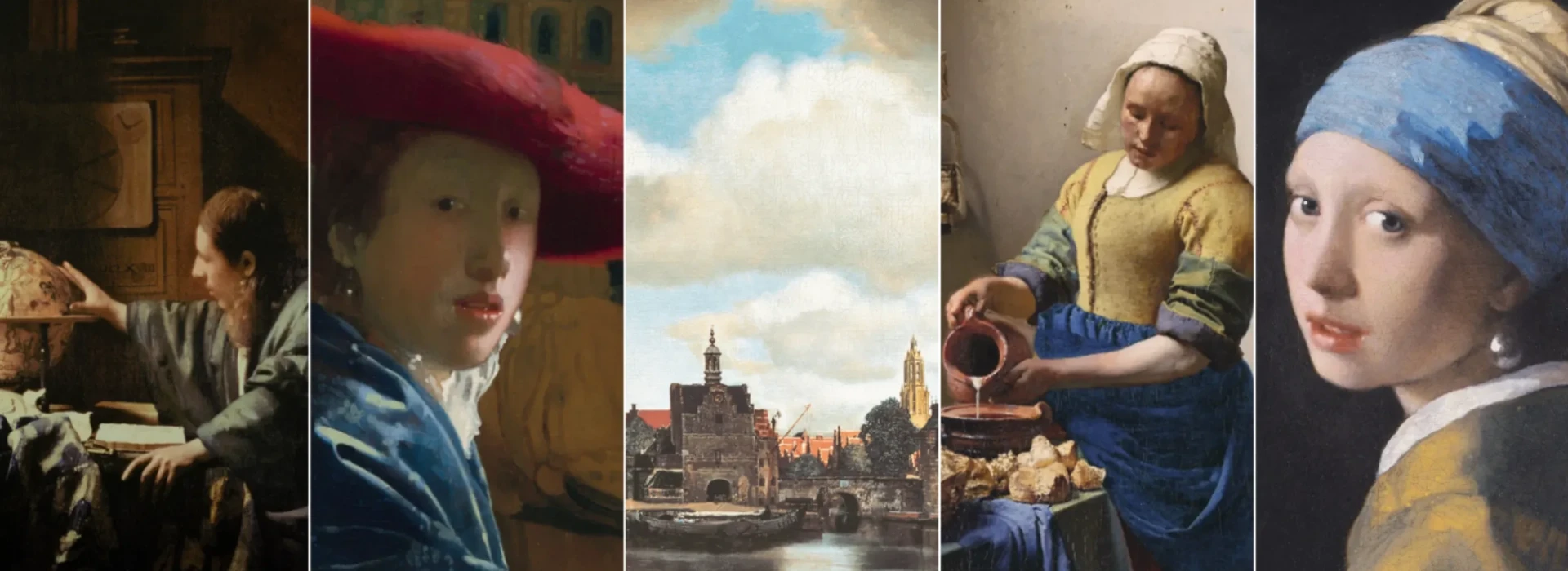
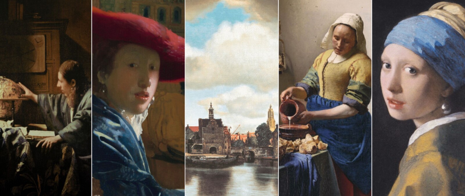
The colour ultramarine blue plays a striking and symbolically rich role in Vermeer's work. His use of blue is not only aesthetic, but also technically and culturally significant. Vermeer uses this colour in shadows, skies, fabrics and reflections, while other painters often used it only for important accents.
Here are a few important aspects:
- Precious pigments: Vermeer used natural ultramarine, a pigment extracted from precious lapis lazuli stone, originating from Afghanistan. This pigment was more expensive than gold in the 17th century, but Vermeer consciously chose quality over cost. This pigment produces a deep, bright and almost mystical blue, visible in clothing and details in his paintings. The name ‘ultramarine’ comes from the Latin “ultramarinus”, which literally means ‘beyond the sea’, referring to the fact that the pigment was imported from Afghanistan. It was traditionally made by grinding the semi-precious stone lapis lazuli, which made it extremely expensive and only the wealthiest patrons could afford it for their paintings.
- Symbolism: in the 17th century, blue symbolised truth, loyalty, serenity and sometimes virginity. In religious painting, blue was often used for Mary, and this may also be echoed in Vermeer's calm, tranquil figures.
- Balance: Johannes Vermeer also used blue to bring balance and tranquillity to his compositions. He often contrasted it with warm colours (yellow, ochre, red) to create depth and harmony in the space.
- Lighting: as a master of light, Vermeer used blue to create cold shadows and emphasise daylight falling through windows. His colours are often transparent and built up in layers (glacis technique), creating a soft, almost velvety depth.
Blue in Johannes Vermeer's work is more than just a colour – it is an instrument of beauty, technique, status and meaning. His use of ultramarine testifies to his refinement and artistic daring, and contributes to the timeless tranquillity and intimacy in his work.
Discover more about Johannes Vermeer's use of colour in the Vermeer studio at the Vermeer Centrum Delft.